Disney PhotoPass Service
Background
Imagine your last vacation. How many photos did you take? 50? 100? 200? What did you do with those photos after the vacation?
Everyone loves taking photos on vacation. But when you return home, most people are overwhelmed with their day-to-day lives and don’t have time to deal with these photos. People capture huge amounts of media, causing major organization headaches. On top of that, they usually feel pressure from their family to share photos immediately.
The goal of this project is to help users focus on the activities truly important to them: enjoying their vacation, reliving their memories, and sharing their stories.
Design Challenges
We identified 3 key challenges:
How do we browse and access photos from a multi-day vacation?
How do we view, buy, edit, or download a photo?
How do we customize and improve an out-of-the-box photobook builder?
Challenge #1: Browse mental model
Our goal was to help save user's time by organizing their photos for them. In our new design, the user navigates by using day by day tabs and vertical scrolling. While the user flips through different days, they have access to a persistent action-pane on the left. The action pane gives easy access to sharing photos, adding more photos, viewing their favorite photos, and seeing timely promotions.
Challenge #2: Photo detail
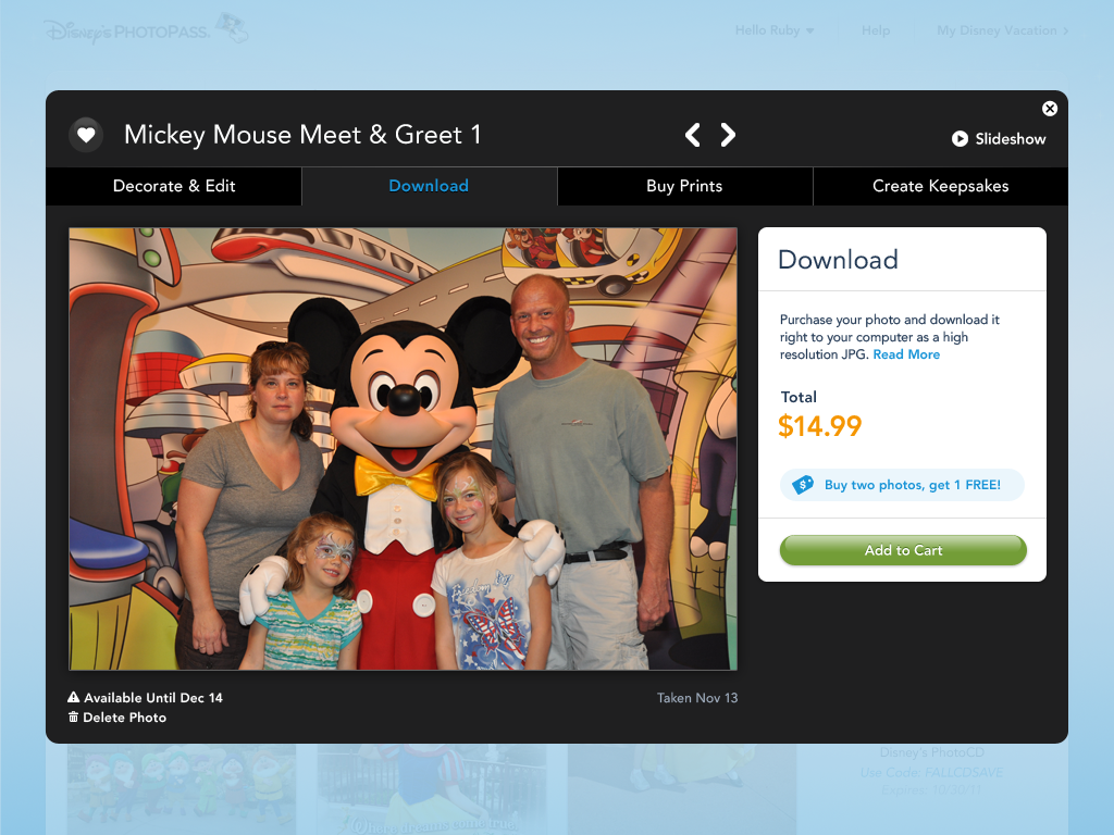
Once a user selects a photo they like, they can take a variety of actions. They can add a border and buy it. They can add a sticker and make a mug. They can add a sticker and a border, and then download it.
To address all these scenarios, we put the photo in a lightbox with the key action items at the top. Users can toggle back and forth between the actions, and the changes to the photo will stay the same.
Old website Photo detail decorate state
Old website Photo detail buy and edit state
New final design Photo detail decorate and edit state
New final design Photo detail buy a download state
Challenge #3: Photobook
My final challenge was to help users create keepsakes with their photos. The photobook is the most popular keepsake, yet also most complicated to make. This design exercise was heavily constrained by the backend photobook tool that could not change in the redesign.
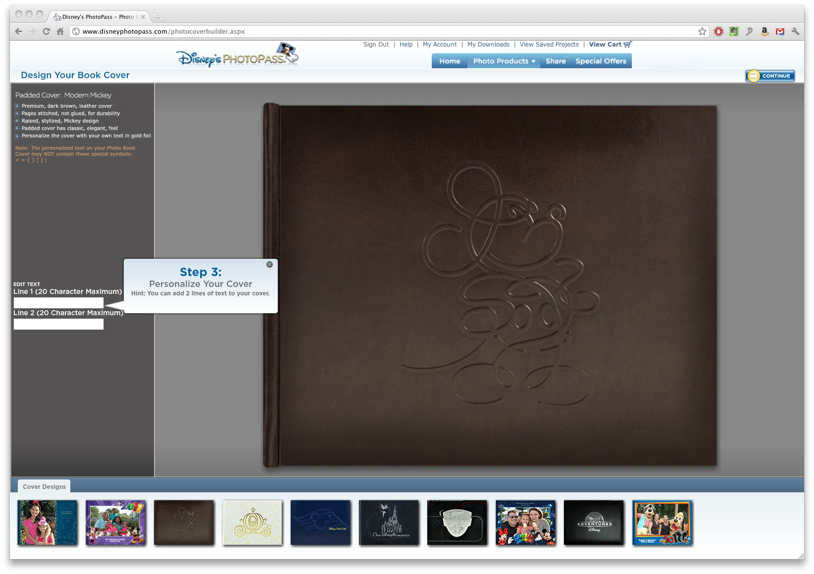
We added a navigation and progress bar so user's had a clear idea where they were in the process, as well as to save and exit midway through a project. When redesigning the layout, we wanted to optimize the preview of the photobook, so we designed collapsing and expanding panels below the photobook.
Old design Photobook select a cover
Old design Photobook create pages
New final design Photobook select a cover
New final design Photobook create pages
Old design Photobook review and check errors
New final design Photobook review and check errors
Technical platform IA
About Project
Interaction designer @ frog
2012
4 months
Website shipping in Sept 2013
Frog design team
Kevin Hutchinson, Creative lead
Vicky Fang, Senior Interaction designer
Stephanie Meier, Interaction designer
Bryan Pieratt, Principal visual designer
Stefanie Krajnyak, Visual designer
Amalia Sieber, Visual designer
Jon Vincent , Program manager
My contributions
Interaction model
Wireframes
Interactive prototype
User Testing


