Boinc Music Streaming Service
ABOUT PROJECT
Interaction designer @ frog
April 2011 - August 2011
5 months
LEARN MORE
Startup closing
FROG DESIGN TEAM
Kevin Hutchinson, Creative director
Vicky Fang, Interaction designer
Dhana Dhanasarnsombat, Visual designer
Amanda Martin, Visual designer
Stefanie Krajnyak, Visual designer
Matthew Sibitroth, Design technologist
MY CONTRIBUTIONS
Participatory design research
Concept development
Information architecture
Interaction Models
Detailed UI design
Cross-platform system design
Background

We've entered a music revolution. Services like Spotify, Rdio, and MOG are opening an infinite music universe where you can listen to anything, without buying or downloading it. These new subscription models create opportunities for new music experiences, such as discovering new music and easily sharing it with friends. There are also new challenges though, such as losing a sense of music ownership, or managing the music you have when you are on, or offline. In early 2011 while working at frog, I worked with a startup called Boinc– a music service that aimed to provide unlimited music across all devices.

What is music? in a participatory design session.
Design challenges
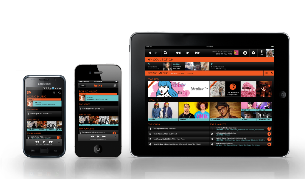
The frog team was tasked to create a foundational design language system applied to two hero applications, a PC client and an Android phone, and extended to the iPhone, iPad, and Android tablet.
We identified 5 key problems to differentiate the service:
- How we give users music ownership, when they have over 10 million songs?
- How do we provide a seamless music experience across multiple devices?
- How do we help people find new music they like?
- How do we encourage people share songs and playlists?
- How should people manage their music available offline?
Challenge #1: Music ownership
When are team started the project, the client was working on an alpha product on multiple platforms. They had an existing hypothesis for the information architecture. All available songs was in a bucket called "the music universe," and users could "bookmark" or "add to playlist" to bucket their favorite music.
After assessing the existing designs, our team suggested alternative IA's that would provide a stronger sense of music ownership to the user. To test these, we conducted a participatory design session where we showed existing designs and new concepts in qualitative interviews. This helped us gain insight into how BO's target users listen to music, which helped our frog team prioritize features.
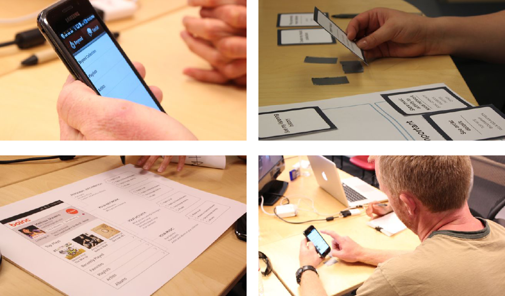
Participatory design session

Participatory design session findings Feature prioritization
In the PDS, users found the existing system and nomenclature confusing. One said, "I don't know what a bookmark would be." and another, "Are those songs? It's easiest to understand simple words like songs." After processing the feedback, we redesigned the information architecture with simple, direct words. We renamed "Music universe" to "BO music," which encompassed all available songs provided by BO. Users could "Add" music from there into "My Collection" by tapping the + icon on any song, album, or playlist.

Desktop app final designs BOINC Music

Desktop app final designs My collection

Android app final designs Android home screen, BOINC music, and My Collection
Challenge #2: Multi-device system
Of the six platforms, we chose to start with the Android. Android's constraints helped us trim the product down to the most essential features, before we scaled up to more flexible platforms.
For Android, we used a dashboard model as branded hub to navigate between "My Collection" and "BO Music." Based on our PDS findings, we knew it was important to provide persistent access to player controls, a prominent search bar, and an immediate way to play music.
When we moved to the desktop app, we wanted to keep a consistent interaction model, and also add more robust features to enhance the experience. We wanted to take advantage of the desktop's larger real estate and flexible layout. Our client encouraged us to adopt some common music application conventions, such as drag-and-dropping songs into playlists. Our team sketched multiple possibilities before converging on the "Parallel Model".
The Parallel Model displays My Collection and BO Music at the same time, one as open and one as a collapsed bar. By clicking into a space or collapsed bar, the user can shift between them. The collapsed bar will surface contextually recommended or related content. We wanted to offer new music recommendations when the users browses in My Collection, and references of My Collection when the user explored BO music.
After the team finished detailed wireframes and visual design for Android and Desktop, we extended the design to iPhone, iPad, and the Android tablet. We adapted the Android design easily to iPhone due by replacing the action bar with a iPhone navigation bar with a back button.
The desktop app translated nicely to the iPad and Android tablet interfaces. We kept the parallel model, and moved the now playing controls into a full screen mode and the playlists into a popover model.


Challenge #3: Music discovery
Our next challenge was to design an unique and fun interface to help people discover music. We started by evaluating new music and analogous applications, such recipe search apps. Based on the popularity of apps such as Pandora, we learned that users liked to start with their favorite artists and songs, and find music similar to that.

Trendscrape Moodagent, Real Simple, and Discovr
With the help of a frog technologist, our team created an interactive air app to prototype the discover experience. The user types in an artist or song, and the system populates eight similar music items around it. Tapping a new item displays more items around it, creating an endless canvas of related music.

Desktop and android app final designs Discover interface for Android Mobile and Desktop app
Challenge #4: Sharing playlists
In addition to helping people discover music, our stakeholders wanted to make a "social music experience." They wanted people to easily share playlists. The problem is, that requires a lot of people to make playlists, which can be a tedious task on a phone.
User research told us that users liked the idea of mood based playlists, but were skeptical of the system's ability to pick the right music. We decided to give users a set of empty default playlists, such as workout, happy, and chill, as a starting point. It would establish common language for sharing and exploring playlists.
To help people discover playlists, we put them at the same level of hierarchy as an artist's album. When a user browses an artist, they can also check out playlists with the artist's songs.

Desktop app final designs Guru profile

Android final designs Android mobile app screens for Album and Profile views

Android app final designs Android mobile app screens for Now playing album cover, Now playing list, Contextual actions on an album.
Challenge #5: Managing offline music
Managing music available offline is a less common use case that can add a lot of complexity to the system. However, our client felt it was essential to get right. Even though most people can stream music with wifi or 3G, it is really important to have music offline when you are on a plan or without service.
Our client wanted to build granular file management system where every song was marked available or not available offline. When we tested this concept with users at the PDS, users told us they didn't want to constantly worry about that. They though adding a song to My Collection meant they were downloading it.
Based on these findings, we recommended combining the concepts of My Collection and offline music by leveraging a "smart caching" system. If the system would automatically download the user's most played, recently played, and recently added songs, for a simpler user experience.
For the users who loved their albums and playlists, we also designed a specific place to move music offline. Users have full control over offline music, but don't need to think about it when they are regularly browsing music.

Ecosystem diagram

Wireframes Managing offline music
