Opower Energy Reports
Background
Opower helps utility companies provide great customer experiences–from mobile and web, to print and email. They sell an enterprise SASS platform to over 100 utilities, and have the energy data of over 50 million households– the largest energy dataset on earth.
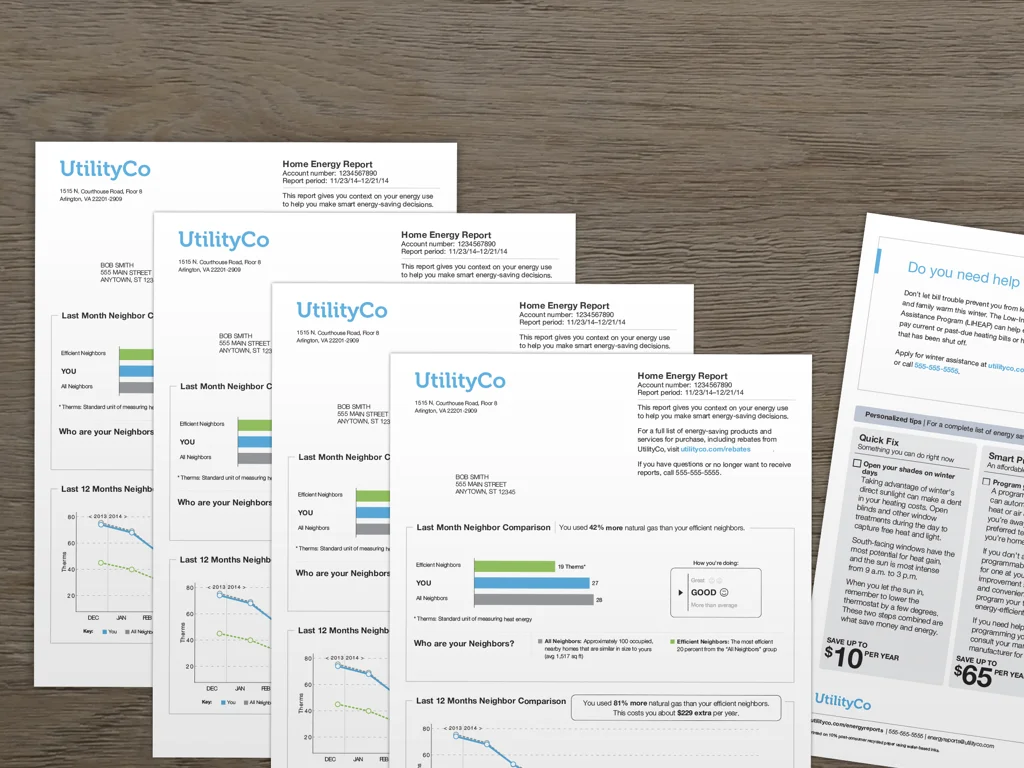
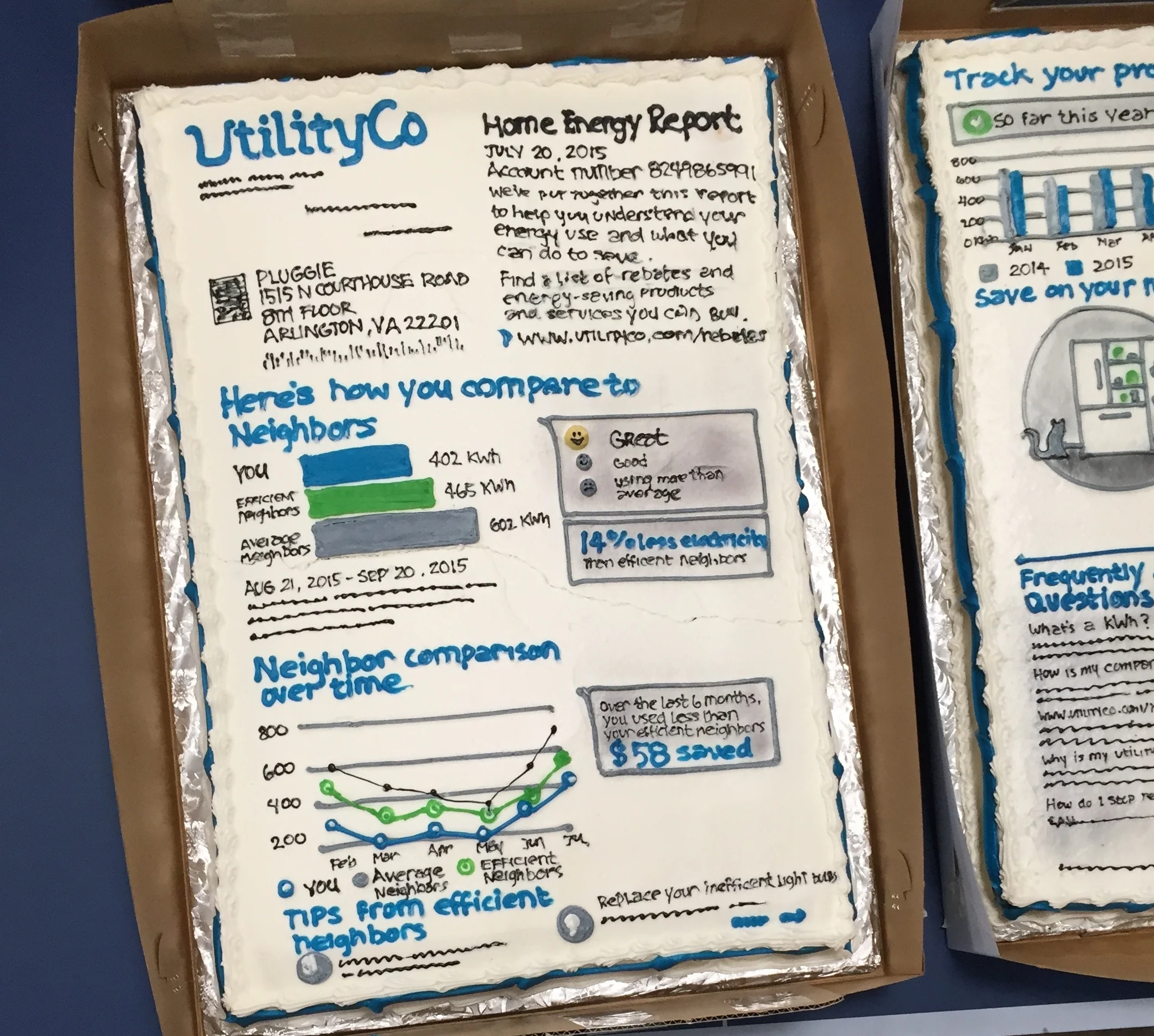
The company was founded in 2007 based on a behavior science study by Robert Cialdini. He found that when you tell households that they are using more energy than their neighbors and how to save energy, people consumed less energy. This lead to Opower's first product: personalized home energy reports that show people how their consumption compares to their neighbors in similar-sized homes.
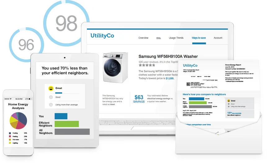
You might be wondering, "Why is this a paper report, and not a website or mobile app?" We chose to send paper reports because that’s the only way we could reach everyone–the utility company has everyone’s home address. Another reason is that we need to assume that people don't care, one of Opower's top design principles. The average person spends 9 minutes thinking about their energy use over an entire year. People are much more likely to read a piece of mail sent to them than searching/downloading/and logging into an app or website.
This product, Home Energy Reports, worked. Opower sold it to over 100 utility clients, and helped save 11 terra-watts of energy savings and over a billion dollars in energy bills. However, by 2015 the product hadn't been changed for over 5 years. The user experience was becoming stale to both the users and our clients. We also needed to transition to a new technology platform that would allow us to send reports at a larger scale and with greater flexibility.
I lead the redesign effort of our core product. There were 700 people at company at this time, and since this product drove 80% of revenue, there were a lot of people with different opinions. Through a cross-functional core team, I worked with R&D (engineering, product, design) and client side (sales, marketing, account managers, and delivery teams) to make sure our new design delivered on both client (utility) and end-user needs.
Design goals
After a month of evaluative research (reading past qualitative research, win/loss analysis of RFPs, stakeholder and expert interviews, analytics and A/B tests), we determined these top goals for the redesign:
Fresh new design
Modern visuals and improved usability.Flexible branding
Customizable reports that put utility brands front and center.Robust marketing
Native ads and improved functionality to enable more robust marketing.Going digital
A compelling email experience layered on print.Dynamic experience
User experience that evolves over time targeting moments that matter.
Opower's Behavioral design framework
I'm going to talk through our new design through a framework we developed to drive behavior change–in this case saving energy. To learn more about the framework, check out my coworker's article: A behavioral approach to product design.
Challenge #1: Grab attention
Make it inviting
Users enter the content through conversational blue headers and explore with easy-to read graphs and delightful illustrations,
Elicit an emotional reaction.
We always start with powerful principle of social norms, by comparing your energy usage to that of similar neighboring homes. Some people get angry, some people laugh. But it gets everyone to pay attention.
Show personalized content.
All the data on the report is the user's real data. We also used an automated tip targeting system to provide relavent energy-saving advice. In December, a homeowner in Chicago would be told to improve their insulation, while an apartment renter in LA might be told to open the blinds to let the sunlight in.
Challenge #2: Influence decision
Clear, straightforward content
We aimed to write for an 8th grade level to be accessible for everyone. This also helped for translations and localization.
Offer recommendations
To help people decide what to do, we suggested both simple habits and long term investments.
Describe the benefits
To nudge them further, we alluded to both the rational payoff, how much money you will save, as well as other benefits, like a more comfortable home.
Reframe the message
We used social proof, "tips from efficient neighbors", to frame our energy saving tips.
Challenge #3: Facilitate action
To talk about taking action, I’m going to show you another Home Energy report that we designed to sent sent out during the summer.
Simplify the action
Instead of suggesting many things to do, we only offer one action: Set to your thermostat to a specific efficient temperature. We built the design for clients to customize the temperature to a reasonable number for their region.
Guide the experience
We tested two different framing techniques: "The goldilocks effect" and "Authority framing"
Trigger at the right moment
We send extra reports in peak summer months, when the temperature is the highest, energy use spikes, and users have the greatest potential to save.
Challenge #4: Sustain long-term behavior
Celebrate progress
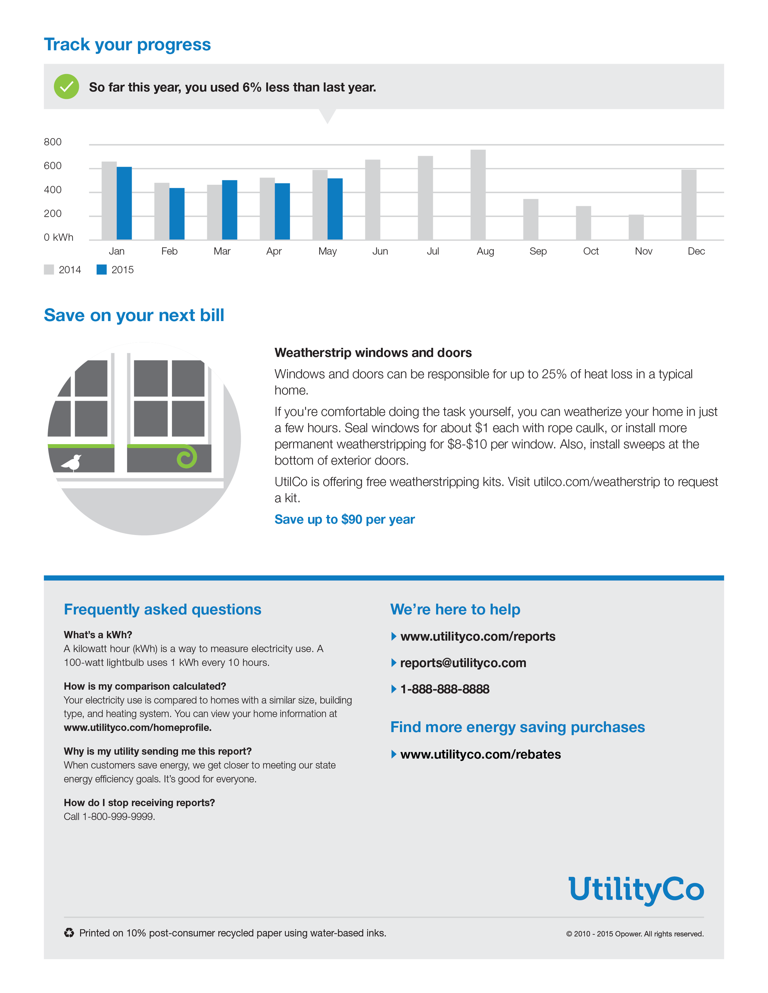
We used smileys to reward people with positive feedback. The year over year tracker showed progress over time.
Emphasize intrinsic motivation
To hit our utility energy efficiency goals, we needed to motivate people to save energy over years, not just a few month. We drew on users' need for a sense of status through the normative comparison. Efficient homes kept saving energy because they wanted to continue to be seen as the "efficient" people.
Build a long term relationship
Through experimentation, we learned that we need to continue sending reports throughout the year to keep up the savings. However, the content need to change over time to keep people engaged. To build an extensible system, we created a system of different modules that could be slotted into various templates.
Results
15 million homes receive home energy reports
3% energy savings
45 independent validations of opower results
10% bump in customer satisfaction
Platform was a launchpad that allowed us to win 3 of our biggest deals in 2016
About project
Lead designer and interim product manager @ Opower
January 2015 - March 2016
15 months
Shipped and currently live
Opower product team
John Davidson, Group product manager
Amir Raminfar, Engineering Manager
Amanda Dowd, Designer
Ben Chao, Front-end engineer
An Yu, Designer
Eunice Chang, User researcher
My contributions
Product vision
User research
UX/UI design
Creative direction
